Prompt Images
Since the turn of the millennium, the color convention company Pantone has nominated a “Color of the Year,” designed to capture the spirit of the milieu in the year ahead. In standard art imitating life imitating art form, it’s tough to say if the color is mined from #vibes that are already happening, or if the color was selected for you by “the people in this room.” Most likely, it’s some combination of those factors, and it cascades through fashion, cosmetics, interior design, packaging, media, and so on.
I’m no expert, but I do have two eyeballs and even more opinions. What follows is my rankings from second-best to worst, with my top pick revealed at the end. Let’s dive in, shall we?
The Good
2. 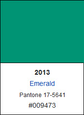
Emerald is a supreme example of how the Pantone Color of the Year should work. This color is bold, memorable, and you can visualize how it would unfurl across high fashion, home decor, and beyond. Plus it’s pleasing to look at. Namaste.
3. 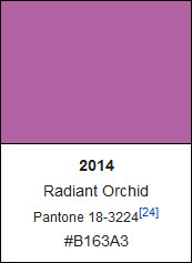
I asked very little of my bridal party: I arranged the transportation for my very modest bachelorette party. My shower took place in a relative’s beautiful backyard. Their dresses didn’t need to match in shape, length, color, or price. Rather, they would be “curated” by me in a one-day extravaganza at the Cherry Hill Mall, resulting in a grouping of women that more closely resembled a girl group than bridesmaids. The one common thread? To please find a pair of Radiant Orchid shoes… even if they’re made by Nike. (Ed. Note: They were wedges!)
4. 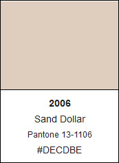
Sand Dollar is far from your average beige. Cool undertones help this familiar hue soothe, but never bore. Sand Dollar looks expensive. If Jil Sander were a color, she would be Sand Dollar.
5. 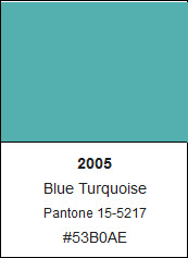
The color that a man hitting on you will tell you your eyes are. Unoriginal, but still a compliment.
6. 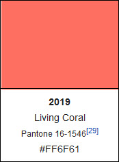
“Speak softly and carry a big kick,” is the first rendering of Roosevelt’s expression that I ever knew, thanks to a prolific girl’s soccer program in my home town. It aptly describes the pleasant yet piquant Color of the Year 2019, Living Coral.
7. 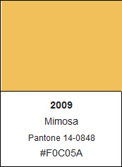
Mimosa feels like a celebration. It’s exciting, it’s vivacious, it’s—oops, that’s too much champagne hurry come grab this before it bubbles over!
8. 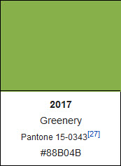
Okay I actually hate this specific color, but, objectively, I have to concede its merits as far as this list is concerned. Greenery is bright and lively and, based on its preponderance in nature, can match nearly any other color. For this reason I think I’ve fairly placed it at #8 on this list.
9. 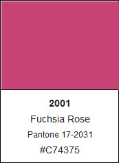
The “basket of kisses” of the Pantone universe.
P.S. to the Sterling Cooper staff: the namesake of a more prestigious agency, Ogilvy & Mather, thinks your should know, “The customer is not a moron. She’s your wife.”
The Meh
10. 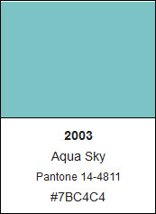
Nobody doesn’t like Aqua Sky. Nobody ~LOVES~ it either.
11. 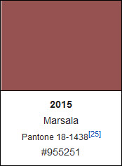
This is a strange pick. Marsala is rich and sumptuous, but hard to imagine as more than an accent. A wall, but not all four; a throw pillow, but not the whole couch; a scarf, but not an overcoat. If it were selected as a secondary Color of the Year, I’d be all in.
12. 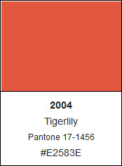
Not a bad color, but a little too far in the Patagonia/Subaru/Yeti universe.
13. 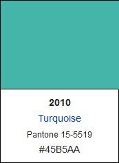
I’m experiencing déjà vu. And while I might personally have a slight preference for 2010’s Turquoise, we’ve already seen this color on the charts here. Sorry, Solange. There can only Be one yoncé.
14. 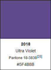
Is it purple? Is it blue? Like indigo, the only color in the rainbow without a standard Crayola equivalent, Ultra Violet is too easily overlooked to define an entire year.
15. 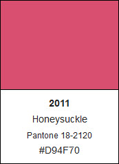
There’s something slightly off about Honeysuckle—a sad tang that poisons an otherwise likable shade.
Have you ever sent a celery stalk through a juicer? No matter how many more apples, oranges, carrots, and pears you add, you can still taste that stalky-ass vegetable. Honeysuckle is the color equivalent to that blender blunder.
The Ugly
16. 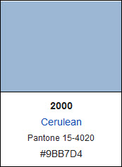
I used to really like this color *checks day planner* It was 2000.
17. 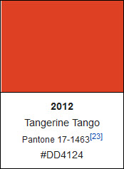
See #13; apply logic to #12.
18. 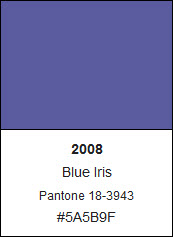
This is a challenging color. While not conventionally ugly, there’s just not a whole lot you can do with it, perhaps on account of the ginormous mascot whose fur is this exact shade. No, not Barney the dinosaur; rather the amorphous Grimace.
19. 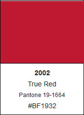
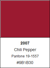
Which is worse? It’s hard to tell. That’s why True Red, Chili Pepper—shoot, Tiger Woods’s entire wardrobe—ties tantamount to last on the leaderboard.
20. 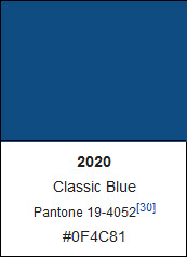
It’s so… corporate. I want to feel something when I see a color of the year, not order more checks. Just like the year it represents, Classic Blue ranks dead last.
The Winner
1. 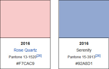
We got a lot wrong in 2016, but we did get one thing right: the joint selection of Rose Quartz and Serenity as The Color of the Year. Is it cheating to have picked two? Well, that’s never stopped anyone before.
If you’ve ever heard the term “millennial pink,” you can understand that Rose Quartz has a place in this year, let alone decade; it is the “it” new neutral. On top of that, it’s just winsome and blithe, without even trying.
Serenity makes a companion nonpareil. Calm. Cool. Perfected.
With the advantage of hindsight, Rose Quartz is the star between the two. But together they live harmoniously beneath an endless sky blue pink firmament.
Notes & Predictions
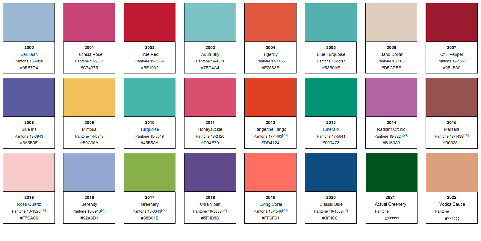
Notice anything interesting in this handy chart complied by Wikipedia, to whom I donate and can therefore plagiarize without punishment*?
I find the peachy totem of Tigerlily, Tangerine Tango, and Living Coral noteworthy. That’s why I’m predicting 2022 will be represented by a warm, sanguine hue that falls in line with the colors above it. I shall name him Vodka Sauce, like his mid-decade predecessor Marsala.
If we survive this apocalyptic year, I believe a deep, vegetal green will usher in 2021. Think about it: the color is noticeably absent from the chart. Indoor plant worship is at an all-time high. It looks fresh and healthy and rejuvenated. In the spirit of what we did with Blue Turquoise and Turquoise, I’m calling it Actual Greenery, but it’s the shade, not the name, I feel confident about.
To fresh beginnings.
*that’s not how it works. But you should totally donate to them anyway.

